8.31.2006

Kickin' It Old School

My girlfriend and I recently moved into a new apartment. And moving into a new place is a great excuse to go through all your stuff and realize what's worth keeping and what's worth tossing out. So for the last two weeks, between working, writing, and fixing up the apartment, I've taken a few minutes every night to go through my art materials.

Although I haven't been drawing for nearly as long as other artists I know, I have my fair share of half-finished sketches, folders packed with references, and boxes filled with "things I'll work on later." But as I was looking through some of my early drawings (at least the ones I kept and the ones that have survived numerous moves), I found this little gem...


The drawing measures 8.5x11 and is fully painted. Not too bad considering how raw I was back in the day. And the figure is pretty good. Although I'll give the disclaimer that it may be copied from an Earthworm Jim video game guide or Earthworm Jim advertisement. But don't give me too much grief about it; I was like 13 or 14 when I drew it. I didn't know any better!

Bernie

8.23.2006

Powerpuff Girls

During my time out at San Diego, one of my few fanboy moments was meeting Powerpuff Girls/Foster's Home for Imaginary Friends creator Craig McCracken. Although he was walking the con floor when I ran into him, Craig was kind enough to take a few minutes to look through my portfolio and offer me some advice. Utter coolness.

So in honor of that moment and Craig's great contributions to the animation world, I got the itch to draw a Powerpuff Girls pinup...featuring Mojo Jojo (cause he's so awesome...and a monkey...and he wears a cape).

I wanted the pinup to feature Mojo Jojo standing in true super evil monkey genius fashion in his lab, located high above the city of Townsville. With the con season at full blast, I didn't get a chance to sketch out a thumbnail for the pinup until Wizard Chicago. But here's what I came up with while sitting in Artist Alley:


The robot was a happy accident but I realized as I was drawing it that the Powerpuff Girls were not in the pinup. The drawing would have worked without the girls but I really wanted to draw the Powerpuff Girls AND Mojo Jojo. So I had to lose the robot and come up with something better. My second thumbnail included a monitor in the background where Mojo Jojo would be watching the girls. Here's that thumbnail:


With a solid sketch to work from, I drew the characters separately. First Mojo Jojo:
Then the PowerPuff Girls:
Although Mojo was not 100% completed on the page, I used a few digital shortcuts to finish him. The girls were a lot harder to draw than I expected. They may look simple, but they each have a specific attitude and feel that has to be drawn correctly. If not, they end up looking "wrong." If you've ever seen the cartoon, you know how they should look. So as an artist, you have to take that into account and make them "feel" like the characters in the show. That comes across in their poses, their expressions, and their positioning in relation to each other. But I was happy with all the characters and once they were scanned into Photoshop, it was onto the next stage.

I wanted to play with a one-color background so I choose the color red to really push the evil genius tone. Nothing too sinister though. Plus, considering Mojo Jojo's colors, he would really stand out. And with his headquarters/observatory being located high above the city of Townsville, I was planning on adding a blue-toned city in the background. Again, blue would contrast really well against the red and the character colors. After a quick Google search for color references on the girls and Mojo, I cleaned up the characters, gave them a nice black border (to stand out against the background), and dropped them into the pinup.

The big change was getting rid of the monitor and placing the girls right outside of the observatory's windows. Once I placed them in that location, it added a little humor to the piece. Good 'ole Mojo is standing there, striking a super villain pose, while the Powerpuff Girls stand outside his headquarters, ready to kick some simian ass.

After four or so hours of Photoshop magic, here's the final result:


Overall, it turned out OK. I definitely want to go back and play around with the evil robot idea so don't be surprised if that shows up on the blog next time I get some free time. Whenever that is.

As always, thanks for looking,

Bernie

8.18.2006

Nightlight Comics pinup

As an artist, when you attend a convention, it's easy to spend a good-chunk-o-change on fellow creators. Someone's artwork inspires you and you have to own a little piece of their magic. And between sketchbooks, prints, and commissions, you just end up spending what little money you make (the only real winner is Kinkos). So someone out there, in their infinite wisdom, created the greatest Artist Alley ritual ever - trading.

Case in point...

I met Matt Chicorel at last years' Fallcon and we had a great time. Matt is the creator behind Nightlight Comics, home to the "Non Adventures of Trenchcoat and Kim." During this years' Wizard World Chicago, Matt was kind enough to give me a copy of his latest issue in exchange for a copy of my Space Ghost pinup. Unfortunately, the con's craziness got the better of me and I forgot to give Matt the pinup. So I decided to make-up for my forgetfulness by drawing a pinup of Matt's characters, Trenchcoat and Kim.

Initially, I was going to go with an action shot. But considering that the book is about their "Non-Adventures," Iit made sense to go with something more lew key. And after reading the latest issue, I immediately new what to do: Trenchcoat And Kim sitting on a roof, waiting for something, anything to happen.

Using a technique that's worked for me a few times now, I decided to draw the characters separately from the background. So here's my rendition of Trenchcoat:

And here's my rendition of Kim:

Trenchcoat turned out OK. But I'm pretty happy with Kim. I tried to give her some of the attitude Matt's gives her in the comic. Hopefully, that comes across in the drawing through her posture and her smoking. As for the background, although I did sketch it out on paper, the majority of the work was done in Photoshop.

So after a few hours of blood, sweat, and tears, here's the final outcome:

Overall, it turned out alright. But the important thing is that Matt likes it. He even said he'd put it in the next issue. Sweet.

Lesson learned: Considering that the pinup took about 5 hours from start to finish, I need to find a way to speed up without losing quality. I know, that sounds like a complete contradiction but I think that ability comes with time and practice. Luckily, I'm willing to put in the hours to keeping developing my style. What's the saying? "If you're not moving forward..."

Bernie

8.16.2006

Wizard World Chicago '06 in the Rearview

Wizard Chicago '06 is now in the books...and I've got the pictures to prove it. You can check 'em out below.


Thanks to everyone that stopped by the Element X table in Artist Alley and took some time to check out our work. And big thanks to those out there that purchased our studio artbook (Atomic). We're down to one copy!

And now, with this year's con season in the rearview, it's back to the drawing board...

Bernie

7.29.2006

Wizard World Chicago


Wizard Chicago is less than a week away and it feels like I just got back from San Diego.

Wait, I just did.

But no complaints here 'cause I seriously love con season. I love seeing the fans, the creators, and the exhibitors. I love the costumes. I love the lines (well, not really, but I deal with them). I love the evenings of drinking and shoptalk. I love it all. And boy do I miss it when it's all said and done.

So if you're in the Rosemont, IL area between August 4-6, make sure to stop by the Donald E. Stephens Convention Center, head back to Artist Alley, and check out tables 3037 and 3038. I'll be there with felow Element X-ers, pimping our wares and having a great time.

Hope to see you there!

Bernie

7.27.2006

SDCC Souvenir Book


Each year the folks at Comic‑Con give each attendee a free trade paperback-sized commemorative souvenir book. This year's theme focused on a number of anniversaries in the fanboy world.

Dick Tracy and the Universal Monsters' turned 75th, Captain America and Archie are 65, Flash and Gumby are 50, and Star Trek is 40.

And not to be forgotten, Space Ghost is also celebrating his 40th Anniversary.

Before Spiderman, Batman, and Superman, Space Ghost was my first real exposure to a superhero. As a kid, I would watch the cartoons every morning before heading off to school. And with the perspective that comes with age, I've come to realize that Space Ghost was one of the major turning points in my appreciation for all things comics and animation.

So I wanted to thank the people at SDCC for giving me the priviledge of contributing to the '06 souvenir book with a pinup (click here to see the color version and here for the black and white version) and an article about Space Ghost and what he means to me. I know Space Ghost is considered as an old school character by some but for those of us that grew up watching his animated adventures, it's nice to see the recognition of his 40th anniversary.

Bernie

7.26.2006

SDCC Animated Panels

During my time at San Diego Comic Con, I had the opportunity to check out a few panels. Most of them were for my own edification since I've been trying to find out more about the animation industry. So I spent some time at a Nickelodeon panel along with a "How to Pitch an Animated Show" panel. But I also had the chance to check out two other animatation-related panels.


Afro Samurai - Featuring the RZA, this panel discussed the upcoming anime mini-series from Gonzo and set to air on Spike TV. The history behind this anime is inspiring, considering that the creator's work was spotted by accident and has since evolved into a full-blown multi-media monster. They also showed the trailer which looked kick ass. Lotsa movement and top shelf animation. Samuel Jackson does the voice work for the main character. And with the RZA handling the music, you know it's gonna rock.

You can check out the trailer here.

The Batman/Teen Titans - This panel discussed the third season for The Batman and also showed some preview footage of things to come. The big change? Robin joins Batman and Batgirl in their crusade against crime. The panel also debuted the Teen Tians: Trouble in Toyko direct-to-DVD movie. I'm not the biggest Teen Titans fan but I've found myself watching the cartoon every once and awhile on Cartoon Network. I'm a much bigger fan of the animation than the storytelling. But the movie was definitely entertaining, occasionally laugh out loud funny, and much better than sitting in a hotel room with only 4-5 cable channels. The villain (Brushogun) was pretty cool.


Hellboy: Sword of Storms - I missed this one (I was too busy hustling potential publishers) but you can actually watch it online right here (as long as you have a DIVX video player; if not you can always download it). I just finished watching the 58-minute panel and the animation for the upcoming Hellboy movie looks awesome. According to the panel, the first movie premieries later this year on Cartoon Network and will then be released on DVD in February of '07. Until then, I'll be checking out the Hellboy blog and the official site for updates.

Bernie

7.25.2006

SDCC Goodies


A list of everything I bought at the con:

Tim Biskup's "The Jackson 500 Volume 2" - I have volume one already and over the last few months, I've become a huge fan of Biskup's work. I had to stop myself from buying everything at the table.

Javier Guzman's "Amalgamation" sketchbook - I fly all the way to San Diego and meet Javier Guzman, fellow Chicagoan and alumni of Lane Tech High School. Javier's style is awesome and I can't wait to hang with the man in our wonderful Windy City.

Dave Johnson's Full-color 2006 sketchbook - Released by Boom! Studios and coming in at $10, Johnson's second sketchbook benefits from the joys of color. Lots of sketches and finished pieces demonstrating Johnson's killer talent. And after speaking with Joe Casey, member of Man of Action, creators of Ben 10, the cartoon was greenlit for a fourth season. So we get to see even more of Johnson's designs in the future, which is always a good thing.

Ragnar's "Kings of the Road" and "Vernaculis" - Kings of the Road is " A cartoonumentary of a life on the road." It's a great-looking and well-packaged look at the folks Ragnar met during his cross-country travels. Highly recommended. Vernaculis is the follow-up to Ragnar's first artbook, Chromaphile. More awesome artwork...and less money in my pocket. But no complaints.

The Shadow - The first in a new series of trade paperback reprints of the original pulp novels. This one features two complete Shadow stories: "Crime, Insured' and 'The Golden Vulture." I'm a sucker for pulp fiction so this one was right up my alley.

Salem: Queen of Thorns - I was aware of this book because one of my favorite artists, Mike Hawthorne, is handling the art chores. But I had a chance to meet the writers at San Diego and they were pretty cool guys. They were debuting the preview issue and I was more than happy to purchase a copy. They also hooked me up with a Salem t-shirt. Sweet.

Rose and Isabel Volumes 1 and 2 - Written and drawn by one of my favorite creators, Ted Mathot, Rose and Isabel is "a story of two sisters who join the American Civil War to save their three brothers." I read both volumes on the flight home and believe me, it's a lot more than that. Surprises abound and the artwork is freakin' amazing. Thanks for the all the hard work, Ted!

Best of Draw! Vol. 1 - Lots of great, in-depth interviews with creators in comics and animation. Among industry pros such as Phil Hester, Klaus Janson, Bret Blevins, and Jerry Ordway, volume one of the "Best of" also features an interview with my hero, Samurai Jack creator Genndy Tartakovsky.

Comic Book Artist #11/Alex Toth - With his passing in the foreground of my mind, I've been trying to find out as much as possible about the late/great Alex Toth. This issue of Comic Book Artist was dedicated to the comics and animation legend and discussed his impact in those industries. It featured a breakdown of Toth's carreer, an autobiographical essay, interviews with creators that he inspired, and a checklist of his work.

Bernie

San Diego in the Rearview

It's over.

San Diego Comic Con is over.

First and foremost, Scorched Earth did not make it as a finalist in the Comic Book Challenge. But that's not a completely bad thing. I had the chance to pitch the project to comics pro Marc Silvestri and super-producer Gale Anne Hurd, both of which were nothing but flattering. The contest should open other opportunities that will help Scorched Earth get to the masses in the near future. So big thanks to all the friends and family that gave their support. It was very much appreciated.

That being said, this was my first year out there and it was a pretty cool experience. Travel complications aside, the con was...OK. Having been to Wizard Chicago for the last five years as an attendee or an exhibitor, I've seen what a "big" convention is like. San Diego is huge, about 3-4 times bigger than Wizard Chicago. It has more exhibitors from the comics/film/television/video game worlds than other cons. And there are more exclusives and con variants than you can shake a stick at.

I guess once your primary goal when attending a con is to network with industry folks and try to get your books picked up by a publisher, having all those fancy exhibitors all over the con floor doesn't mean much. The con becomes more of a networking opportunity than a fan event. But nonetheless, it was cool to see the celebrities and non-comic people out and about among the fanboys and fangirls.

I took a few pictures and bought a few items so I'll post it all little by little. Not only do I have a big move coming up before the end of the month, Wizard Chicago is also right around the corner. So you can imagine that things are a little hectic at casa de Bernie. But once Wizard has come and gone, I'll be able to get back onto the drawing board and post more doodles.

Bernie

7.17.2006

The Comic Book Challenge...and Bernie!

Hey all,

Platinum Studios and NBC's San Diego affiliate partnered to create a contest called the Comic Book Challenge. The Challenge was an open call for creators to submit their projects in the hopes that it would be chosen for review by a panel of "celebrity" judges including Marc Silvestri, Gale Anne Hurd, Scott Mitchell Rosenberg, a staff correspondent for People, an editorial director for The Hollywood Reporter, and...Ving Rhames!

The judges' bios can be seen here.

Well...they picked one of my projects as a semi-finalist!

The project is called Scorched Earth. I'm the writer on the book and fellow Element X-er Tim Irwin is the artist.

You can check out a preview image of Scorched Earth here.

The last week has been crazy because I've had to read a lot of paperwork and get ready for the pitch. Along with 49 other creators, I get two minutes to knock the judges' socks off. So you can imagine how paranoid/nervous/excited I am, espcially since San Diego is only a few days away.

If I'm fortunate enough to make it as one of three finalists, I get to do the pitch on television and then it goes into online voting to determine the grand prize winner. Details on the three projects will be available for review online and voting will be open to the public from July 21 till noon July 24th right here.

If I make it that far, and you seriously like Scorched Earth, check out the site and vote. Tim and I would definitely appreciate it.

Thanks,

Bernie

7.10.2006

Shelf-O-Stuff


Here's a little peak at my main shelf-o-stuff, protected by an animated Batman figure and Hellboy. The small yet powerful wooden shelf has been with me for a number of years and holds most of my educational/research books, trades, graphic novels, and inspirational artbooks.

And random baseball bat. You know, for protection. From ninjas. And stray cats.

Once I move into my new apartment, I'll finally be able to take the rest of the books out of my parents' basement (I promise mom!) and add it to the collection.

I'll probably need a bigger shelf.

Bernie

7.08.2006

Podcast Premier


I popped my podcast cherry last week on Around Comics. Here's the episode summary:

"Comics on TV. The premier of Blade inspired the panel to discuss comic book adaptations on television. Can Blade survive past the movies? What does it take to make a compelling show that's based on a b-list comic character? The Flash, The Incredible Hulk, Witchblade and others are discussed as we welcome Mike Oliveri, Bernie Gonzalez, and Matt Sommer to the roundtable."

You can check out the episode at the Around Comics website here and direct download it here (right click over the link then "Save Target As").

If you're not digging on podcasts, you should definitely check 'em out. Most of them are free to download, can be played on your computer or I-Pod/MP3 player, and they're great to listen to in the background as you work.

Bernie

6.15.2006

On Technique

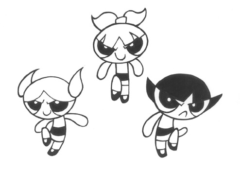
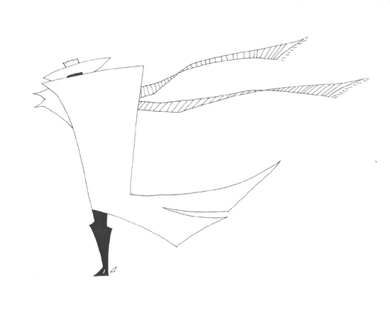
Since I've already covered the style I'm using for ONE, I'll go over technique.

If you think of style as being what you do, technique is how you do it. Technique is the actual mean/s the artist utilizes to get their ideas on paper (or monitor, or canvas, or music sheet, etc). Some artists like to use expensive drafting tools, some use mechanical pens bought at their local Walgreens, and others use Sharpie markers that are almost dry. They all work, but not all of them work for everyone. So while technique is important, as an artist, you can't be a slave to it. The most important thing is how to get your ideas out of your head and on the paper.

Here's an awesome quote by Neal Adams' in Will Eisner's Shop Talk that goes a little further into the topic:

"What I find is that there are many artists doing many things, and each successful artist has found his own tools. Very rarely does an artist accept the tools of another artist. His responsibility does not include responsibility to other artists or to the general public. His responsibility is to himself. The tools he uses are the tools he finds. The thing he has to think about is what is his goal, not what is his technique."

Amen. It's all about the goal. And as the artist, it's up to you to choose the best technique that will allow you to accomplish your goal.

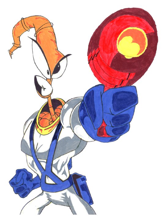
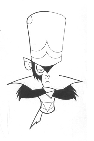
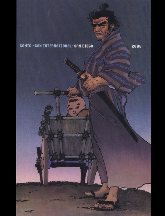
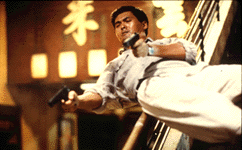
With ONE, I want the book to feel like an episode of Samurai Jack...but in print. I want to utilize a lot of epic shots and give it a cinematic pacing. I want the reader (actually, audience is more appropriate 'cause there's only one word in the entire book so there's not much reading going on) to be able to get through the book in ten minutes. I'll let C. C. Beck (again, from Will Eisner's Shop Talk) say it best:

"Never include anything that doesn't belong there...[convey] a message to the reader in the simplest form...[Most] young artists are so anxious to show off, all of them, to show things that they can do, that they throw in a bunch of stuff that doesn't belong there. If you have to stop to figure out a picture for about three minutes, then you've lost the thread of the story."

Amen. Again.

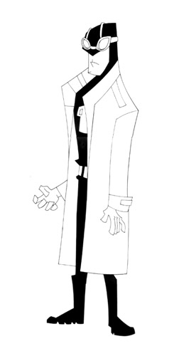
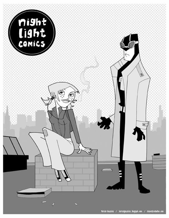
I also want to be able to handle the creation of the book. It is, after all, my first real book. Not that I want to make it easy on myself, but I don't want to shoot myself in the foot by trying out new tools and working methods that I'm not already comfortable with. That's why I'm using the animated style. And that's why I'm sticking to good ole pen and paper (8.5x11, nothing fancy) for the actual pages and Photoshop for finishes (cleaning up, editing, coloring, design).

So with my goals in mind, I made a few ground rules. I have to give credit to Ted Mathot for sharing his own ground rules on his book, Rose and Isabel (which I'll be purchasing at the San Diego Comic Con in a few weeks). I basically ripped off some his rules. Yeah, I'll admit it. But they make 100% sense. They helped me decide how to approach ONE best; how to reach my goals.

1. ONE will be in greyscale - Like Mathot said, "Although B&W can be very challenging, it's nowhere near as difficult as color (for me)." I agree. I'm just getting into color theory so grayscale is something I can manage. I'll probably go with a color cover but as far as the interior pages are concerned, grayscale is law. This will also come in handy when I start researching printing options. Grayscale, by far, is cheaper to print than color. And if I end up using a printing service like Lulu or Dream Weaver Press, my checkbook will thank me for going gray.

2. No Rendering - Quoting Mathot: "The greys must be flat color or simple gradients. At the very most I allowed myself a drop shadow or rim light." I'm using shadows here and there to convey scope and specific moods but that's as far as I'm going to allow myself to go on ONE. I'm not even getting into using too many gradiants. Greyscales and flats - check.

3. No fancy brushes or textures - I'm still relatively new to Photoshop so I wouldn't even know how to use the fancy brushes and textures. And since I've already storyboarded most of the book, I already know where I can reuse and repurpose backgrounds. ONE is getting the KISS treatment: Keep It Simple Stupid.

4. Keep Moving - Mathot, again: "If a drawing isn't right (and there are many I'm not totally happy with) I have to keep going. I'll take a few whacks at it, but then move on. If it really bothers me, I'll try to come back to it later." I'm pretty anal about my work but if I plan to stick to my schedule, I can't get hung up on minutiae. And speaking of scheduling...

5. Come up with a schedule and stick to it - Quoting Mathot: "This is absolutely essential. Know how much work you need to do and how much time you have to do it. Comics are great for time management cause you can break them down by pages. You can assign X number of pages per month, week, day, etc. If you fall behind or get ahead it's easy to adjust that number." Told ya, the man knows what he's talking about.

Initially, my deadline was mid-July, just in time to have the book completed by the San Diego Comic Con. But reality has set in and the possibility of completing what has grown to be a 250+ page book (aka monster) in the next month has been thrown out of the window. So taking into account what I've done so far, what I need to do, and those pesky real world things that are bound to materialize along the way, ONE should be finished by the end of this year. I may be able to finish the book before then but that gives me ample time to do some quality control and make sure my first book is a good book, at least to me.

Now that style and technique are in the rearview, time for more pretty pictures. Next up - storyboards.

Bernie

6.13.2006

Cars

My ten-year high school reunion went down this weekend, making me feel really old. Well, that didn't bother me nearly as much as feeling like I haven't developed or utilized my drawing skills to a higher level. I've seen the volume of work some of my peers have produced and it's enough to make this grown man cry. But I'm not one to sob in the corner so I put foot to ass and went to work.

So after Surly Sergio's Sombreros and between some sudden and unfortunate family issues, I found two hours to watch Disney and Pixar's Cars.

I know, I know. Not exactly work but it's kinda like reference. Kinda.

The movie was good; not Pixar's best but a good, entertaining film nonetheless. The set up for the film took a little too long but once the action moved to the small town (Radiator Springs), the movie went into (excuse the pun) high gear. But overall, the animation was solid and the voice acting was spot. Then again, it's not like they went out on a limb with the character archtypes they choose (ex. Mexican lowrider car voiced by Cheech Marin; Redneck towtruck voiced by Larry The Cable Guy).

So, back to getting some more drawing under my belt. With Cars as inspiration, I did some sketching. Here's the result:


And after a few hours of Photoshop-ing, here's the final drawing:


Turned out OK. I could've done more with the overall perspective and the car designs but the drawing was just a quick reaction to watching the film.

Enough digressions for this week. Now back to ONE.

Bernie

6.10.2006

Weekend Digression Part 2

Still working on ONE...really. The focus for this week has been on storyboarding the story. I have an idea on how the entire book plays out but I wanted to thumb(nail) out some of the key scenes to make sure it flows. I'll post some of the thumbs next week and also discuss the logistics on how I'm going to go about actually completing the pages. I may have addressed style, but technique is also extremely important, especially on a project like ONE. In the meantime, here are a few pretty pictures.

Continuing with the retro cereal box theme - Surly Sergio's Sombreros.


Not much in the initial sketch but I put down just enough to figure out where to go with the piece. I wanted Surly Sergio to have a Yosemite Sam-like quality; a short ball of fire that could go crazy anytime. I also added a little Eli Wallach from his character in The Good, The Bad, and The Ugly. Now on to the next step...


I added a few elements like the "XXX" beer bottle (probably NOT on your average supermarket cereal box), changed Sergio's left arm (mirroring the right arm just made sense), and came up with a solid look for the actual cereal. Like Perky Pete's Pigtails, Sombreros are much easier to imagine as cereal than an actual drawing. And a quick Google search gave me a few references for the Mexican styled bowl. I also added a slight texture to the sky so it would stand instead of being just a flat light blue. So far, so good.

Here's the final cereal box design:


Not as retro as I wanted but, well, too bad. As I was adding the design elements, I thought of a few things I could change to give it a true retro feel but I decided that the piece was solid on its own. I'm happy with Sergio's design, I like the overall color scheme, and texturing the sky was a new learning lesson. So I'll put the ideas in my mental toolbox and utilize them on the next drawing.

I have two more ceral box designs left: Happy Hippo's Hoops and an extra special cereal that I'll share before the end of the month. Stay tuned.

Bernie

6.05.2006

On Style

After a weekend of ballyhoo and hijinks, it's back to work on ONE.

With the main character designed and the the first background complete, it's time to answer some of the big questions regarding the project. The foundation for ONE, the high concept, is pretty simple when you think about it (here's a reminder for those that came in late):

One world. One main character. One bad guy. One journey. One spoken word. One climax. One panel per page. One book. One creator.

The high concept is great but its execution will determine if it works. That's where style and technique come in; two very different beasts that are sometimes mistakenly equated with each other.

I'm sure I'll get a few disagreements out there but in my mind, style comes from the artist. It's the extension of the person's personality/influences, translated through a medium (paper, film, music, etc) and determined by the artist's level of skill. Sure, whatever inspires you will likely work it's way into the art you produce. But as a creator, your mind acts as a funnel for everything you've been exposed to that has peaked your interest on numerous cognitive and intuitive levels. Your skill allows those ideas to take shape to the best of your abilities. And like any other muscle, you have to develop it if you want it to get stronger. The more you draw, the stronger and more personal your style will be.

Admitingly, my style has been a work in progress. Still is. Will be for as long as I draw. It's a constant evolution that is affected by everything around me. I think the growth comes from finding what you like to do and making it your own. You start with a solid foundation of what feels "right" and you run with it. You create. And you let the creations represent you because, in many ways, they are you. Sure, you may like the way another arist draws an ear or a hand so you incorporate it into you own skill set. Into your style. That's natural. Just like Jack Kirby said: "One man is a school for another.” But knowing your style is being comfortable in your own skin. Knowing just enough about yourself to be able to express it.

I'm not sure who said it but I guess when you think about it, putting pen to paper is a brave act.

As for me, my school is varied - Alex Toth, Jack Kirby, Bruce Timm, Akira Kurosawa, Rod Sterling, Gendy Tartovsky, Mike Mignola, Scott Morse, Frank Espinoza, Ben Caldwell, Darwyn Cooke, Tim, Biskup, Dan Krall, Ted Mathot, Mark Andrews, Sam Hiti, Matt Hawthorne, Dave Johnson, Lesean Thomas, Sandford Greene, Jim Mahfood, Dave Crosland, Mike Huddleston, Ghostbot, Guy Davis, Ashley Wood, Ragnar, Ovi Nedelcu, Erik Larsen.

All these creators have somehow affected my style. And for ONE, I wanted to be really comfortable in my own skin for the first time. So far, you've seen some of the sketches for the project and you can see that I'm going with an "animated" style. Look at my portfolio and you'll find Tim Bradstreet, Travis Charest, Jim Lee, and countless of other comic artists. It took years of drawing to finally find my way...but animation has always been a big influence. It's tied directly into my love of film and my love for illustration. Animation marries them like no other medium can.

But I'm coming to the realization that the "animated" style is my style. It feels "right." It's my perspective. And like my dad always said, "It's all about perspective."

Bernie

6.04.2006

Weekend Digression

Sorry for the delay between posts but this weekend, 3/5's of the Element X crew (Amado, Marcus, and myself) got together to check out some art from our respective projects and enjoy a trip to a few local comic shops. Anytime we get together, the pretty pictures are free flowin' and hours start disappearing. But the comradre of fellow artists cannot be equaled; it helps to recharge the creative batteries and it pushes you to draw more/better. So once we go our separate ways, the desire to draw left behind is hard to resist.

Anytime you work on a project, it can get easy to lose your focus and begin wavering. Not that ONE is losing it's fun factor but changing gears and drawing something completely different helps on a lot of levels. It keeps you fresh as an artist, forcing you to utilize your skills beyond the task at hand. It changes your artistic perspective. You learn to work out problems by exposing yourself to illustrating new things. And hopefully, you can add that newfound knowledge to your skill set.

You hear it all the time from the pros out there that are working on a monthly title. They start their day with a quick sketch, allowing their mind and body to loosen up before going into full sequential mode.

So...having purchased the Krazy Kids' Food! Vintage Food Graphics book recently, I wanted to take a stab at designing a fake retro cereal box. While my girlfriend was watching a 3-hour made-for-television Audrey Hepburn movie starring Jennifer Love Hewitt, I started skeching and came up with this:


Perky Pete's Pigtails. Heh. I also came up with Happy Hippo's Hoops and Surly Sergio's Sombreros. I'll get to them soon enough. As for Perky Pete, here's the colored version, sans cereal box design:


After scanning the pencils, I just dug in and finished it in Photoshop. The actual cereal was probably the hardest part. Coming up with the name was easy. But drawing actual cereal pigtails? Not so much. I also did a few designs for the bowl but quickly realized that a detailed design, however retro, would go against the simplicity of the overall drawing.

After a few hours of work, here's the full-blown retro cereal box:


And because I couldn't resist...
The whole thing took the better part of my Sunday. What can I say, I'm a little anal about design and I wanted to make sure it was perfect (plus, as hard as it may be to believe, I didn't mind missing out on the Audrey Hepburn flick, even if it was Jennifer Love Hewitt's best acting performance to date...next to Scream, because, well, she screamed...alot). But the whole process was worthwhile. I'm pretty happy with the drawing and I learned a few Photoshop shortcuts that I'll take with me when I go back to ONE. Problem is, now I can't wait to work on Happy Hippo's Hoops and Surly Sergio's Sombreros.

If there were only more hours in the day there'd be time enough at last (a little Twilight Zone reference for those not in the know).

Bernie

5.31.2006

No One Puts Backgrounds in the Corner

When it came time to attend high school, I had two choices: 1. Attend my "assigned" high school located about 4 miles from my parent's home, or 2. Apply to another, much better but much farther high school and hope for acceptance based on my grades.

I chose the latter.

My high school of choice? Lane Technical High School, located on the corner of Western and Addison in Chicago, about 2 miles from glorious Wrigley Field (home of former MLB team Chicago Cubs, present home of the most expensive AAA team in the sport...a little Cubs humor, sorry). Here she is in all her glory...


God, it was huge. Still is.

Anyway, the "Technical" part of the school's title meant that they had fields of study such as drafting, woodworking, and engineering along with the regular college prep courses. I picked drafting. That meant that for the duration of my stay at Lane, drafting would constitute the core of my classes. Architecture 101, Architecture 102, AutoCAD, Landscapes, Machinery, Advanced Drafting. Yup, took them all.

That concentrated exposure to drafting and architecture for four years was a key factor in shaping how I would come to view art. I started to appreciate backgrounds, cityscapes, landscapes, and machinery blueprints more than characters. Perfect sketches of human anatomy just didn't compare to an engine's internal specs. I even remember buying some Legend of the Dark Knight issues because they had Anton Furst's Gotham city designs for the first Batman movie.

As the years passed, I knew what I was looking for in my comics, movies, and animation: good design, well-constructed backgrounds, and interesting layouts. So I gravitated towards creators such as Katsuhiro Otomo, Bruce Timm, Genndy Tartakovsky (also a Lane Tech alumni), and Nihei Tsutomu; and their creations: Akira, Batman: The Animated Series, Blame, Samurai Jack, Biomega, Star Wars: Clone Wars.

So when thoughts of ONE started developing and shaping in my head, I knew I wanted to create a project where the background and the design were characters of their own. And not just extras or walk-ons; I'm talking about full fledged name-in-the-opening-credits characters. Easy to say, not so easy to do. At least I knew exactly where ONE took place - Mad Max/Avalon/Akira/Samurai Jack post-apocalytic wasteland wonderland. That meant lots of debris, rubble, and collapsed buildings.

Collapsed buildings. What a great place to start.

That's the actual line art, drawn on 8.5x11 using a mechanical pencil, assorted Micron .005 pens, Sharpie fine point markers, and about 1/4 of an eraser. Took about an hour to complete. The final, grayscaled version can be seen at the top of the blog.

Go ahead, take a look. I'll wait.

The final, grayscaled version was done in Photoshop 7 and the aid of caffeine. Lots if caffeine. I'm a self-educated Photoshop user so I'm sure it takes me twice as long to do something in the program then it probably should. But if I had to guess-timate, I'd say the clean-up and grayscales took about 3 hours.

Overall, I was really happy with the final drawing. Exactly what I'd set out to do. Moreover, I knew I was onto something when my girlfriend looked at it and asked me if I drew it. So with the first background complete, it was time to get serious about the book's design and really cement the style I would be using for the project.

Bernie

5.25.2006

Bad Ass & Bald

Now that I'm back from my Samurai Jack season 3 marathon...

As I was saying, I came to the realization that the main character needed a human face rather than just the trio of circuitry dots. But considering that this is my first full solo comic creation adventure, I wanted to create a face that I wouldn't get sick of drawing over and over again. It had to be simple and iconic. Guys like Mignola and Toth can do it in their sleep. Their styles are very economical in the linework department but the results are beyond effective. They draw just enough to let the audience know what's what.

After skimming through a few Hellboy trades, I pulled out some of my animation artbooks for reference, mainly the Batman: The Animated Series and The Incredibles artbooks. Both books have some amazing concept sketches that detail the amount of work that goes into designing a character's head/face. I also went through Frank Espinoza's Rocketo trade (one of my newest prized possessions). Although I'm not working with a brush like Espinoza uses on Rocketo, he utilizes a limited number of strokes to create all the elements of a face. That's the level of efficiency I was looking for.

Since I'm a movie buff, I also like to imagine who would play the part of a character if the book was made into a film. I treat it like a shorthand for the character as I work on the project. If I'm stuck with a scene or a line of dialogue, I just picture the actor performing the action and it provides some momentum. For ONE's main character, I knew I wanted him to be older and weathered. And the second I realized he needed a face, I'd thought of Clint Eastwood's character in Unforgiven.


Scars, squinted eyes, wrinkles, crow's feet - the whole nine. Then I rememberd how much I liked Ed Harris' character in Enemy at the Gates. He played an older, battle-hardened German sniper who was sent to hunt down Jude Law.

There was something very cool about Harris in this role that I wanted to replicate in the main character's head/face. He was calculated and thoughtful. Harris made you believe that he could stalk someone down and snipe them from hundreds of yards away with only one shot.

All that being said, here's my first sketchbook attempt:

A few good things came out of these sketches that found their way to the final design - the bald head, the scarf design, and the eye scar. The bald head made sense because it suggested age and a level of sophistication or aristocracy. Think Captain Picard in Star Trek: The Next Generation. The scarf covering the face reinforced the post-apocayptic Mad Max thing I'm going for. And the scar made him look bad ass.

With those elements in hand I took one more trip to the sketchbook. Here's the result:

He came out a little too lanky so I had to crop the sketch a little. But overall, I'm diggin' his look. Not only will he be fun and relatively easy to draw, the design allows me to play around with contrast and shadows.

"I love it when a plan comes together."

Bernie

5.22.2006

Robot Evolution

I got a little sidetracked with the last post but I hope you don't mind. Just like a director might do research for his film by watching other movies or looking at certain illustrators or photographers, I'll give you the DVD-behind-the-scenes-making-of-featurette to everything I'm digging into as I work on ONE. In some small way, I'm sure it all works itself into the final product. But I'll try to keep the occassional digressions entertaining with the inclusion of some pretty pictures.

Alright, back to work...

So once the robot idea emerged, I wanted to flesh out the design. Here's my first stab at him:


So far, so good. The Kirby-esque circuitry dots theme was moving in the right direction. And all that black makes him look kinda sleek (at least to me). So after performing a little Photoshop magic, here are two variations, all cleaned up and grayscaled.


As you can tell, the second cleaned-up robot has a few more circuitry dots thrown in. At first, I thought they made the design look too busy. But after going over it a few times (and showing it to my girlfriend), I think it's the better of the two. Considering that the robot is pretty much all black anyway, the dots make up for the lack of detail and add some texture. They also give the design that cool Kirby/Timm/DC animated cartoons/Dave Johnson feel.

Once I was done with these drawings, I went back to work on the final outline for the story. Most of the story was already cemented but I wanted to go back and nail down a few loose ends before putting more time on the drawing table (or my living room carpet, same difference). I'll drop a credit to my buddy Andre for being a good sounding board. We've been friends for a long time and his input on whatever I'm working on is always useful. Just like that episode of Star Trek: The Next Generation where Picard and the Darmok talk in a language rooted in alien metaphor, Andre and I do the same thing but with movies, animation, comics, and video games.

I'm very much a visual learner so it was helpful to be able to stare at the the final robot and use the drawing as an anchor for the narrative. Sometimes that's all it takes. One solitary image can make the whole story come into focus.

But as I was looking at the robot, I came to a realization that he needed a face. A human face.

If the whole concept was based on one character performing one action, the audience would have to create some type of connection to the main character. I'm not talking about "feeling his pain;" I'm talking about being able to look at his face and see a pair of eyes, not a pair of dots (or a trio of dots, same difference). Taking into account the climax of ONE, I just felt that the dots don't allow for that connection to exist.

So it was back to the sketchpad.

Bernie

5.18.2006

Concept Sketches

Afer gaining some inspiration from looking at those four old Drifter drawings, I pulled out my sketchpad and went to work. That in itself is a relatively big departure for me because I really don't do any sketching. I typically keep the designs in my head and drop them on the page when I start working on a drawing. And since almost all of my drawings are taken to completion (you'll only find a handful of unfinished drawings in my possession), I tend to work stuff out on paper rather than in a sketchpad. Maybe not the best method but it's worked for me (can't say the same for the number of erasers I've killed along the way). It makes me feel like I'm being efficient with my time and energy.

But lately, I've been questioning whether I've just gotten lucky on the page or if I'm settling for what works when a little doodling in a sketchbook might make for a better drawing. I don't want toss out the "Everyone else does it" line and make it sound like I'm jumping on the band wagon...cause I'm not. Just wondering if I might be able to develop my skills by simply doing some more sketching before jumping to the final drawing.

Alright, enough thinking aloud (or rather, in type). Where was I?

So...after gaining some inspiration from looking at those four old Drifter drawings...blah, blah, blah...sketchpad. Got it. So here's what I came up with.


I was trying to push the Western theme out of the picture by giving the character more of a post-apocalyptic feel by way of the goggles and the hood. That would explain the disappearance of the cowboy hat. However, the scarf was a keeper. It was an element that seemed to work from the Drifter drawings so I decided to keep it. Plus, flowing scarfs are cool. Remember Shinobi? There you go.

As I was playing with the post-apocalyptic idea, I thought about pushing it a little further. Here are the results:


I know, I know. Is that a robot? Yup. Not sure how he got on the page but maybe there is some magic in sketching. The hat came back, albeit briefly. But the robot idea got me thinking.

Bernie

5.16.2006

A Little More Background

Have you ever seen one of those evolution diagrams where they show the transition from the monkey to the upright man?


Well, when I was developing Drifter, by comparison, my drawing skills were at the amoeba stage. I was able to handle some basic concept designs but quickly came to the realization that my drawing skills were not up to par.

And unlike other artists who were the “art kid” in school or drew mini-comics featuring Superman fighting Spiderman, I’d simply never developed that muscle. No practice makes perfect. No sketchbook sessions. No late-night drawing frenzies under a blanket with a flashlight. If I was going to work on the project, I knew I’d have to put forth some serious effort and work to become something resembling an artist.

This is the part of the movie where the “Five Years Later” caption would appear. We’re talking early 2006.

After some stylistic changes and a few false starts, Drifter was still on the indefinite wait list. By now, I’d developed over a dozen comic projects and filled a handful of portfolios with artwork. But I still hadn’t worked on my own book. There was nothing out there that was 100% me.

More than ever, I wanted to take on a book that I could write, design, storyboard, illustrate, color, and letter all on my own. So I started looking at my old drawings for inspiration and found some of the early Drifter designs. Among them, I found four drawings that got the wheels turning.


The style was simple…but it worked. Thing is, I didn’t want to do a Western. I didn’t want to do Drifter. In those five years, I’d taken the Drifter concept to another level and it had become something completely different. But these four drawings got me thinking.

I had this idea called ONE that was never really fleshed out beyond the main concept. It would be a challenge but I felt I could handle it.

One world. One main character. One bad guy. One journey. One spoken word. One climax. One panel per page. One book. One creator.

One.

Bernie

5.14.2006

A Little Background

About ten years ago (wow, has it really been that long?), I was working at Best Buy with two of my best friends, Chris Stevenson and Andre Walker. During our shifts, aside from complaining about the company and management, we'd talk about comics, movies, animation, video games, and all things fanboy. But the really good conversations happened at Chris' house where we'd talk about the state of the entertainment industry and attempt to answer the age old question: "Well, what would you do different?"

As fans, we just weren't getting what we needed. Something was missing. Something was wrong. And, of course, we knew how to fix it. Our collective knowledge, built upon thousands of hours of movie/cartoon watching, reading comics, and playing video games gave us (at least in our minds) the perfect resume. So we put foot to ass and decided to create some of our own stories.

Comics was the easist way to go because, in our infinite wisdom, it seemed easy. You write a story, someone draws it, and you have an instant comic. Oh how little did we know. In hindsight, I can see that the concepts we created were born from the same comics, television shows, movies, and video games that we were obsessing over at the time. Chris created Watchers, a Buffy: The Vampire Slayer-esque WB teen drama. Andre created Black Dragon, a gritty, urban hero that was a cross between Batman and The Punisher.

And I created Drifter.


At the time, I was really into John Woo. I'd never seen anything quite like A Better Tomorrow, Hard Boiled, or The Killer in American cinema. So I read up on Woo and found that one of his influences was a director named Sam Peckinpah.


In an attempt to connect the dots, I watched The Wild Bunch, The Getaway, Bring Me the Head of Alfredo Garcia, and Straw Dogs. The Wild Bunch struck the biggest cord. Even though I'd become quite the movie buff, I'd always felt that Westerns were lame so I'd never really allowed myself to watch any of them. But The Wild Bunch was different. So I kept connecting the dots and ran into Sergio Leone.


A Fistful of Dollars. For A Few Dollars More. The Good, The Bad, And The Ugly. Once Upon A Time In The West.


Eventually, I'd round off my Western education with some Clint Eastwood, mainly Pale Rider and Unforgiven.

During this time, I was also discovering the world of animation.


I was watching the Batman and Superman animated series’ religiously.


They paved the way for the Fleischer Superman cartoons.

And I was starting to get into anime thanks to Giant Robo, Ninja Scroll, and Robotech.

Animation became a viable art form, capable of maturity and inventiveness beyond the after school and Saturday morning cartoons I’d watched as a kid.

So it should come as no surprise that my idea for a comic was Drifter - a gritty western revenge tale filled with violence and bloodshed, set in the backdrop of a barren wastelend…and told in an animated style with cinematic pacing.

With concept in hand, it was off to the drawing board.

Bernie