5.31.2006

No One Puts Backgrounds in the Corner

When it came time to attend high school, I had two choices: 1. Attend my "assigned" high school located about 4 miles from my parent's home, or 2. Apply to another, much better but much farther high school and hope for acceptance based on my grades.

I chose the latter.

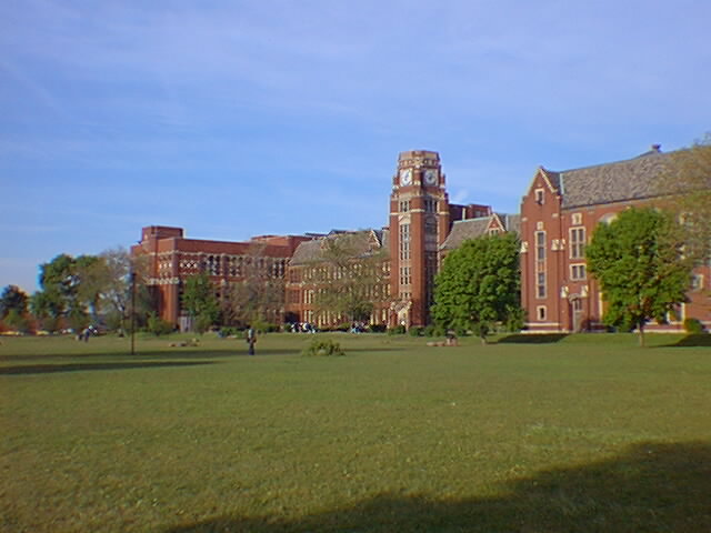
My high school of choice? Lane Technical High School, located on the corner of Western and Addison in Chicago, about 2 miles from glorious Wrigley Field (home of former MLB team Chicago Cubs, present home of the most expensive AAA team in the sport...a little Cubs humor, sorry). Here she is in all her glory...


God, it was huge. Still is.

Anyway, the "Technical" part of the school's title meant that they had fields of study such as drafting, woodworking, and engineering along with the regular college prep courses. I picked drafting. That meant that for the duration of my stay at Lane, drafting would constitute the core of my classes. Architecture 101, Architecture 102, AutoCAD, Landscapes, Machinery, Advanced Drafting. Yup, took them all.

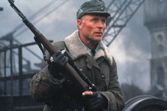
That concentrated exposure to drafting and architecture for four years was a key factor in shaping how I would come to view art. I started to appreciate backgrounds, cityscapes, landscapes, and machinery blueprints more than characters. Perfect sketches of human anatomy just didn't compare to an engine's internal specs. I even remember buying some Legend of the Dark Knight issues because they had Anton Furst's Gotham city designs for the first Batman movie.

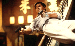
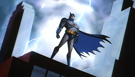
As the years passed, I knew what I was looking for in my comics, movies, and animation: good design, well-constructed backgrounds, and interesting layouts. So I gravitated towards creators such as Katsuhiro Otomo, Bruce Timm, Genndy Tartakovsky (also a Lane Tech alumni), and Nihei Tsutomu; and their creations: Akira, Batman: The Animated Series, Blame, Samurai Jack, Biomega, Star Wars: Clone Wars.

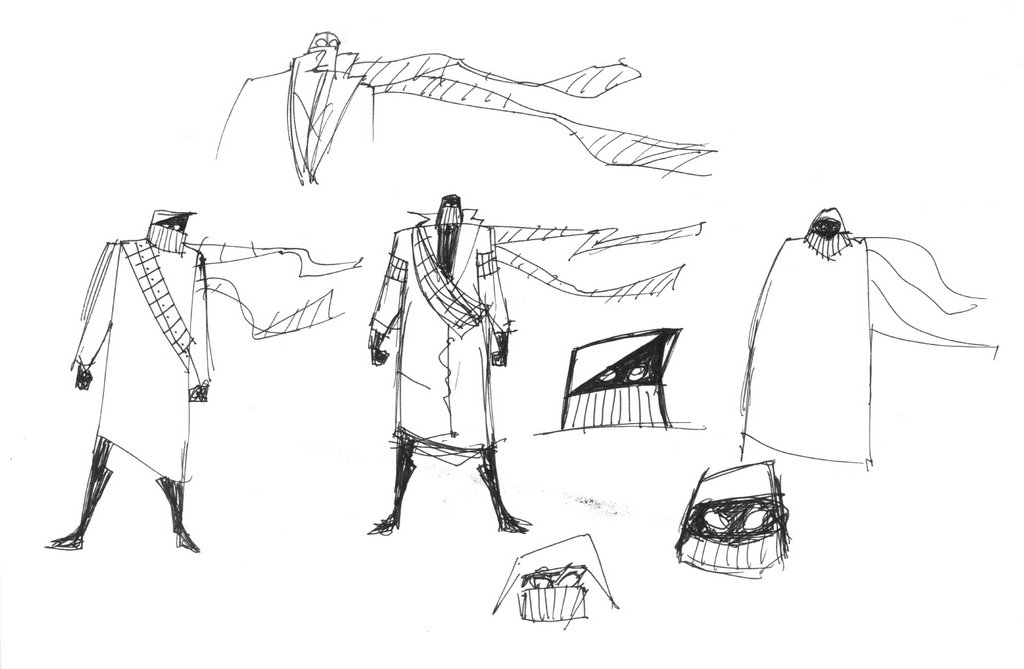
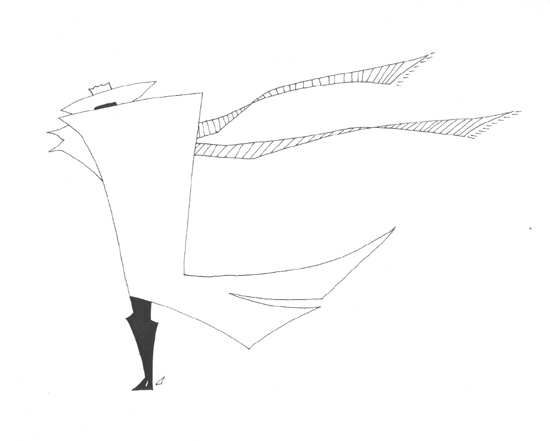
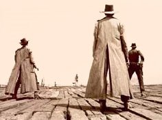
So when thoughts of ONE started developing and shaping in my head, I knew I wanted to create a project where the background and the design were characters of their own. And not just extras or walk-ons; I'm talking about full fledged name-in-the-opening-credits characters. Easy to say, not so easy to do. At least I knew exactly where ONE took place - Mad Max/Avalon/Akira/Samurai Jack post-apocalytic wasteland wonderland. That meant lots of debris, rubble, and collapsed buildings.

Collapsed buildings. What a great place to start.

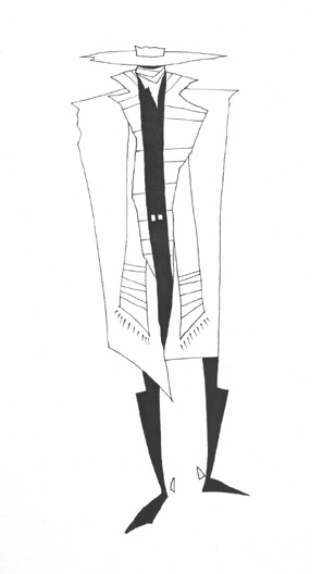
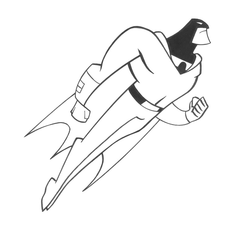
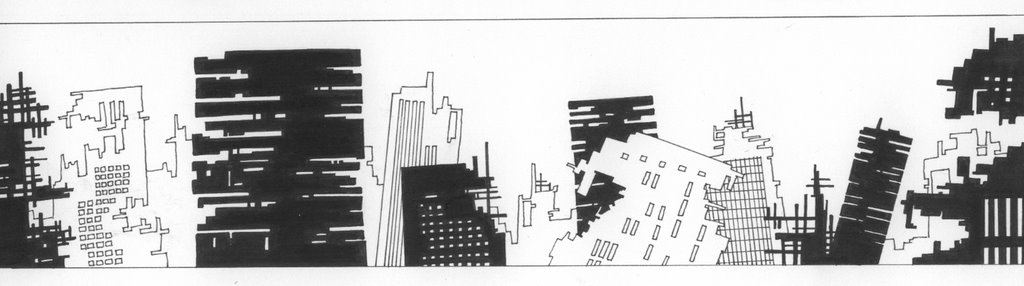
That's the actual line art, drawn on 8.5x11 using a mechanical pencil, assorted Micron .005 pens, Sharpie fine point markers, and about 1/4 of an eraser. Took about an hour to complete. The final, grayscaled version can be seen at the top of the blog.

Go ahead, take a look. I'll wait.

The final, grayscaled version was done in Photoshop 7 and the aid of caffeine. Lots if caffeine. I'm a self-educated Photoshop user so I'm sure it takes me twice as long to do something in the program then it probably should. But if I had to guess-timate, I'd say the clean-up and grayscales took about 3 hours.

Overall, I was really happy with the final drawing. Exactly what I'd set out to do. Moreover, I knew I was onto something when my girlfriend looked at it and asked me if I drew it. So with the first background complete, it was time to get serious about the book's design and really cement the style I would be using for the project.

Bernie

5.25.2006

Bad Ass & Bald

Now that I'm back from my Samurai Jack season 3 marathon...

As I was saying, I came to the realization that the main character needed a human face rather than just the trio of circuitry dots. But considering that this is my first full solo comic creation adventure, I wanted to create a face that I wouldn't get sick of drawing over and over again. It had to be simple and iconic. Guys like Mignola and Toth can do it in their sleep. Their styles are very economical in the linework department but the results are beyond effective. They draw just enough to let the audience know what's what.

After skimming through a few Hellboy trades, I pulled out some of my animation artbooks for reference, mainly the Batman: The Animated Series and The Incredibles artbooks. Both books have some amazing concept sketches that detail the amount of work that goes into designing a character's head/face. I also went through Frank Espinoza's Rocketo trade (one of my newest prized possessions). Although I'm not working with a brush like Espinoza uses on Rocketo, he utilizes a limited number of strokes to create all the elements of a face. That's the level of efficiency I was looking for.

Since I'm a movie buff, I also like to imagine who would play the part of a character if the book was made into a film. I treat it like a shorthand for the character as I work on the project. If I'm stuck with a scene or a line of dialogue, I just picture the actor performing the action and it provides some momentum. For ONE's main character, I knew I wanted him to be older and weathered. And the second I realized he needed a face, I'd thought of Clint Eastwood's character in Unforgiven.


Scars, squinted eyes, wrinkles, crow's feet - the whole nine. Then I rememberd how much I liked Ed Harris' character in Enemy at the Gates. He played an older, battle-hardened German sniper who was sent to hunt down Jude Law.

There was something very cool about Harris in this role that I wanted to replicate in the main character's head/face. He was calculated and thoughtful. Harris made you believe that he could stalk someone down and snipe them from hundreds of yards away with only one shot.

All that being said, here's my first sketchbook attempt:

A few good things came out of these sketches that found their way to the final design - the bald head, the scarf design, and the eye scar. The bald head made sense because it suggested age and a level of sophistication or aristocracy. Think Captain Picard in Star Trek: The Next Generation. The scarf covering the face reinforced the post-apocayptic Mad Max thing I'm going for. And the scar made him look bad ass.

With those elements in hand I took one more trip to the sketchbook. Here's the result:

He came out a little too lanky so I had to crop the sketch a little. But overall, I'm diggin' his look. Not only will he be fun and relatively easy to draw, the design allows me to play around with contrast and shadows.

"I love it when a plan comes together."

Bernie

5.22.2006

Robot Evolution

I got a little sidetracked with the last post but I hope you don't mind. Just like a director might do research for his film by watching other movies or looking at certain illustrators or photographers, I'll give you the DVD-behind-the-scenes-making-of-featurette to everything I'm digging into as I work on ONE. In some small way, I'm sure it all works itself into the final product. But I'll try to keep the occassional digressions entertaining with the inclusion of some pretty pictures.

Alright, back to work...

So once the robot idea emerged, I wanted to flesh out the design. Here's my first stab at him:


So far, so good. The Kirby-esque circuitry dots theme was moving in the right direction. And all that black makes him look kinda sleek (at least to me). So after performing a little Photoshop magic, here are two variations, all cleaned up and grayscaled.


As you can tell, the second cleaned-up robot has a few more circuitry dots thrown in. At first, I thought they made the design look too busy. But after going over it a few times (and showing it to my girlfriend), I think it's the better of the two. Considering that the robot is pretty much all black anyway, the dots make up for the lack of detail and add some texture. They also give the design that cool Kirby/Timm/DC animated cartoons/Dave Johnson feel.

Once I was done with these drawings, I went back to work on the final outline for the story. Most of the story was already cemented but I wanted to go back and nail down a few loose ends before putting more time on the drawing table (or my living room carpet, same difference). I'll drop a credit to my buddy Andre for being a good sounding board. We've been friends for a long time and his input on whatever I'm working on is always useful. Just like that episode of Star Trek: The Next Generation where Picard and the Darmok talk in a language rooted in alien metaphor, Andre and I do the same thing but with movies, animation, comics, and video games.

I'm very much a visual learner so it was helpful to be able to stare at the the final robot and use the drawing as an anchor for the narrative. Sometimes that's all it takes. One solitary image can make the whole story come into focus.

But as I was looking at the robot, I came to a realization that he needed a face. A human face.

If the whole concept was based on one character performing one action, the audience would have to create some type of connection to the main character. I'm not talking about "feeling his pain;" I'm talking about being able to look at his face and see a pair of eyes, not a pair of dots (or a trio of dots, same difference). Taking into account the climax of ONE, I just felt that the dots don't allow for that connection to exist.

So it was back to the sketchpad.

Bernie

5.18.2006

Concept Sketches

Afer gaining some inspiration from looking at those four old Drifter drawings, I pulled out my sketchpad and went to work. That in itself is a relatively big departure for me because I really don't do any sketching. I typically keep the designs in my head and drop them on the page when I start working on a drawing. And since almost all of my drawings are taken to completion (you'll only find a handful of unfinished drawings in my possession), I tend to work stuff out on paper rather than in a sketchpad. Maybe not the best method but it's worked for me (can't say the same for the number of erasers I've killed along the way). It makes me feel like I'm being efficient with my time and energy.

But lately, I've been questioning whether I've just gotten lucky on the page or if I'm settling for what works when a little doodling in a sketchbook might make for a better drawing. I don't want toss out the "Everyone else does it" line and make it sound like I'm jumping on the band wagon...cause I'm not. Just wondering if I might be able to develop my skills by simply doing some more sketching before jumping to the final drawing.

Alright, enough thinking aloud (or rather, in type). Where was I?

So...after gaining some inspiration from looking at those four old Drifter drawings...blah, blah, blah...sketchpad. Got it. So here's what I came up with.


I was trying to push the Western theme out of the picture by giving the character more of a post-apocalyptic feel by way of the goggles and the hood. That would explain the disappearance of the cowboy hat. However, the scarf was a keeper. It was an element that seemed to work from the Drifter drawings so I decided to keep it. Plus, flowing scarfs are cool. Remember Shinobi? There you go.

As I was playing with the post-apocalyptic idea, I thought about pushing it a little further. Here are the results:


I know, I know. Is that a robot? Yup. Not sure how he got on the page but maybe there is some magic in sketching. The hat came back, albeit briefly. But the robot idea got me thinking.

Bernie

5.16.2006

A Little More Background

Have you ever seen one of those evolution diagrams where they show the transition from the monkey to the upright man?


Well, when I was developing Drifter, by comparison, my drawing skills were at the amoeba stage. I was able to handle some basic concept designs but quickly came to the realization that my drawing skills were not up to par.

And unlike other artists who were the “art kid” in school or drew mini-comics featuring Superman fighting Spiderman, I’d simply never developed that muscle. No practice makes perfect. No sketchbook sessions. No late-night drawing frenzies under a blanket with a flashlight. If I was going to work on the project, I knew I’d have to put forth some serious effort and work to become something resembling an artist.

This is the part of the movie where the “Five Years Later” caption would appear. We’re talking early 2006.

After some stylistic changes and a few false starts, Drifter was still on the indefinite wait list. By now, I’d developed over a dozen comic projects and filled a handful of portfolios with artwork. But I still hadn’t worked on my own book. There was nothing out there that was 100% me.

More than ever, I wanted to take on a book that I could write, design, storyboard, illustrate, color, and letter all on my own. So I started looking at my old drawings for inspiration and found some of the early Drifter designs. Among them, I found four drawings that got the wheels turning.


The style was simple…but it worked. Thing is, I didn’t want to do a Western. I didn’t want to do Drifter. In those five years, I’d taken the Drifter concept to another level and it had become something completely different. But these four drawings got me thinking.

I had this idea called ONE that was never really fleshed out beyond the main concept. It would be a challenge but I felt I could handle it.

One world. One main character. One bad guy. One journey. One spoken word. One climax. One panel per page. One book. One creator.

One.

Bernie

5.14.2006

A Little Background

About ten years ago (wow, has it really been that long?), I was working at Best Buy with two of my best friends, Chris Stevenson and Andre Walker. During our shifts, aside from complaining about the company and management, we'd talk about comics, movies, animation, video games, and all things fanboy. But the really good conversations happened at Chris' house where we'd talk about the state of the entertainment industry and attempt to answer the age old question: "Well, what would you do different?"

As fans, we just weren't getting what we needed. Something was missing. Something was wrong. And, of course, we knew how to fix it. Our collective knowledge, built upon thousands of hours of movie/cartoon watching, reading comics, and playing video games gave us (at least in our minds) the perfect resume. So we put foot to ass and decided to create some of our own stories.

Comics was the easist way to go because, in our infinite wisdom, it seemed easy. You write a story, someone draws it, and you have an instant comic. Oh how little did we know. In hindsight, I can see that the concepts we created were born from the same comics, television shows, movies, and video games that we were obsessing over at the time. Chris created Watchers, a Buffy: The Vampire Slayer-esque WB teen drama. Andre created Black Dragon, a gritty, urban hero that was a cross between Batman and The Punisher.

And I created Drifter.


At the time, I was really into John Woo. I'd never seen anything quite like A Better Tomorrow, Hard Boiled, or The Killer in American cinema. So I read up on Woo and found that one of his influences was a director named Sam Peckinpah.


In an attempt to connect the dots, I watched The Wild Bunch, The Getaway, Bring Me the Head of Alfredo Garcia, and Straw Dogs. The Wild Bunch struck the biggest cord. Even though I'd become quite the movie buff, I'd always felt that Westerns were lame so I'd never really allowed myself to watch any of them. But The Wild Bunch was different. So I kept connecting the dots and ran into Sergio Leone.


A Fistful of Dollars. For A Few Dollars More. The Good, The Bad, And The Ugly. Once Upon A Time In The West.


Eventually, I'd round off my Western education with some Clint Eastwood, mainly Pale Rider and Unforgiven.

During this time, I was also discovering the world of animation.


I was watching the Batman and Superman animated series’ religiously.


They paved the way for the Fleischer Superman cartoons.

And I was starting to get into anime thanks to Giant Robo, Ninja Scroll, and Robotech.

Animation became a viable art form, capable of maturity and inventiveness beyond the after school and Saturday morning cartoons I’d watched as a kid.

So it should come as no surprise that my idea for a comic was Drifter - a gritty western revenge tale filled with violence and bloodshed, set in the backdrop of a barren wastelend…and told in an animated style with cinematic pacing.

With concept in hand, it was off to the drawing board.

Bernie

5.13.2006

Friday Night Fun

With my girlfriend camping in Michigan for the weekend, I decided to take advantage of the freedom by throwing all my art supplies on the living room and sketching like a madman.

Yeah, I know. Pretty lame.

But here's what emerged...


Since I've been trying to develop my animated-style skills, I kept this one simple. Although I didn't do a full pose, just imagine her being pretty tall and having really long legs. That's probably the only way she could have her (ahem) relatively large chest.

After a good scan and half-an-hour of Photoshop-ing, here's what she turned into...


Bernie

5.10.2006

Space Ghost - Part Three

Alright, here is the final colored pinup.


However, since the souvenir book is printed in black and white, I converted the pinup to grayscale. After playing around with the contrast, here's how it turned out.


I sent it over to the good people in charge of the San Diego souvenir book before the April 15th deadline and I got an email confirming that they received it. I guess I'll find out if it made it into the souvenir book once I get to San Diego in July. If it made the cut, it'll be a cool surprise. But if it doesn't, that's OK. It was fun to work on.

Bernie

5.08.2006

Space Ghost - Part Two

With Space Ghost complete, it's on to the background.

Like I mentioned in the previous post, I knew I wanted to show Space Ghost flying through the cosmos and I wanted to stick to the an "animated" feel. Having already channeled a little Alex Toth, I decided to go to another master for some inspiration - Jack "The King" Kirby.

A few weeks ago, I was on one of my online surfing sprees and stumbled upon a small gallery of Kirby artwork. And as I was checking out the pages, I realized how far Kirby's genius extends. So I ran to my local comic shop and bought Marvel Visionaries: Jack Kirby volume 1.


It's an oversized hardcover that collects a quite a few highlights from Kirby's time at the House of Ideas. To say the least, I ate it up. His layouts, inking, designs, techniques...brilliant. It goes without saying that I'll be the proud owner of volume 2 very soon.

With pencil in hand and Kirby at my side, I went to work. Since I'd already drawn Space Ghost, I took into account how much space he would take up and where he would fit in the shot. After some loose roughs of the planets, some random space stuff, and a few Kirby dots, I went right into inking. The whole thing came together pretty fast.


The Kirby dots didn't come out exactly the way I wanted but I'll chalk it up to a learning lesson. Next time I'll get it right.

With Space Ghost and the background complete, I scanned in both elements and worked a little Photoshop magic. I ended up shrinking Space Ghost alittle more than I intended but it made for a better layout.

I'll post the final pinup next.

Bernie

5.07.2006

Space Ghost - Part One

Since this is the first year I'm going to San Diego, I've been going over the Comic-Con website looking for travel info, guest updates, and anything that'll make a trip half-way across the country that much more fun and worthwhile. And as I was perusing the site, I saw that the con gives each attendee a copy of a trade paperback sized souvenir book.

These year's souvenir book celebrates a number of comic-related themes, including Universal Monsters' 75th Anniversary, the 75th Anniversary of Dick Tracy, Captain America's 65th Anniversary, Archie's 65th Birthday, the 50th Anniversary of Gumby, and...

...the 40th Anniversary of Space Ghost.

"Before he went "Coast to Coast," he was a popular 60s' Saturday morning cartoon character. Comic-Con celebrates the enduring appeal of this character who has survived to become a Cartoon Network "talk show host" and the star of his own DC Comics mini-series!"

I love Space Ghost. He was the first superhero I was exposed to as a kid and he made quite a big impression. And since I couldn't pass up this opportunity to contribute to the San Diego souvenir book, I drew a pinup of Space Ghost in his full space flying glory.

I knew I wanted to show Space Ghost flying through the cosmos so the character's pose came pretty easy. I wasn't sure about the background just yet (beyond the cosmos idea) so I drew the character separately. As for style, I wanted to stick to the an "animated" feel so I channeled a little Alex Toth along with some Bruce Timm for good measure.

This was also the first time I've ever used a brush pen which was an interesting challenge (although I had to resort to some of my steadfast .005 Microns for some cleanup work). I'm not a 100% brush convert just yet but I'm going to practice with them for a while and see if I can add a new tool to the skill set.

And here he is.


Overall, I think he came out alright. Now for the background.

Bernie

5.06.2006

New Work Blog


Whoever created "blogging" should really pat themselves on the back. What a simple and interactive means of communication. And the good people at Blogger shuld also engage in some well-deserved back patting for making the actual blogging process easy. You always have the option to customize and accessorize but if you just want to write down a few thoughts or post a picture, the logistics are not beyond the average person's capabilities.

That being said, I've got a ton of artists' blog sites saved under My Favorites and it's pretty cool to see them utilizing their blogs as work diaries. Some artists post their work from the first sketch to the final illustration. Some discuss their inspirations and provide links to other amazing and talented people. And some artists use the blog as a sounding board for their ideas, even if it is a one-way conversation in their mind. But all of the blogs provide an insight into the artistic process that is hard to come by outside of standing over the artist's shoulder as they work.

So I'm gonna give it a shot with my own blog and to give anyone that cares to look a little insight into my artistic process. I'm also going to keep this separate from the Element X blog I frequently update. I'm sure there'll be some crossover but this blog will center on whatever sketch/pinup/project I'm working on at the time with a few rants and raves thrown in for good measure.

I'll try to keep it entertaining.

Bernie