I chose the latter.
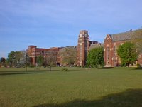
My high school of choice? Lane Technical High School, located on the corner of Western and Addison in Chicago, about 2 miles from glorious Wrigley Field (home of former MLB team Chicago Cubs, present home of the most expensive AAA team in the sport...a little Cubs humor, sorry). Here she is in all her glory...

God, it was huge. Still is.
Anyway, the "Technical" part of the school's title meant that they had fields of study such as drafting, woodworking, and engineering along with the regular college prep courses. I picked drafting. That meant that for the duration of my stay at Lane, drafting would constitute the core of my classes. Architecture 101, Architecture 102, AutoCAD, Landscapes, Machinery, Advanced Drafting. Yup, took them all.
That concentrated exposure to drafting and architecture for four years was a key factor in shaping how I would come to view art. I started to appreciate backgrounds, cityscapes, landscapes, and machinery blueprints more than characters. Perfect sketches of human anatomy just didn't compare to an engine's internal specs. I even remember buying some Legend of the Dark Knight issues because they had Anton Furst's Gotham city designs for the first Batman movie.
As the years passed, I knew what I was looking for in my comics, movies, and animation: good design, well-constructed backgrounds, and interesting layouts. So I gravitated towards creators such as Katsuhiro Otomo, Bruce Timm, Genndy Tartakovsky (also a Lane Tech alumni), and Nihei Tsutomu; and their creations: Akira, Batman: The Animated Series, Blame, Samurai Jack, Biomega, Star Wars: Clone Wars.
So when thoughts of ONE started developing and shaping in my head, I knew I wanted to create a project where the background and the design were characters of their own. And not just extras or walk-ons; I'm talking about full fledged name-in-the-opening-credits characters. Easy to say, not so easy to do. At least I knew exactly where ONE took place - Mad Max/Avalon/Akira/Samurai Jack post-apocalytic wasteland wonderland. That meant lots of debris, rubble, and collapsed buildings.
Collapsed buildings. What a great place to start.
 That's the actual line art, drawn on 8.5x11 using a mechanical pencil, assorted Micron .005 pens, Sharpie fine point markers, and about 1/4 of an eraser. Took about an hour to complete. The final, grayscaled version can be seen at the top of the blog.
Go ahead, take a look. I'll wait.
The final, grayscaled version was done in Photoshop 7 and the aid of caffeine. Lots if caffeine. I'm a self-educated Photoshop user so I'm sure it takes me twice as long to do something in the program then it probably should. But if I had to guess-timate, I'd say the clean-up and grayscales took about 3 hours.
Overall, I was really happy with the final drawing. Exactly what I'd set out to do. Moreover, I knew I was onto something when my girlfriend looked at it and asked me if I drew it. So with the first background complete, it was time to get serious about the book's design and really cement the style I would be using for the project.
Bernie

No comments:
Post a Comment