As I was saying, I came to the realization that the main character needed a human face rather than just the trio of circuitry dots. But considering that this is my first full solo comic creation adventure, I wanted to create a face that I wouldn't get sick of drawing over and over again. It had to be simple and iconic. Guys like Mignola and Toth can do it in their sleep. Their styles are very economical in the linework department but the results are beyond effective. They draw just enough to let the audience know what's what.
After skimming through a few Hellboy trades, I pulled out some of my animation artbooks for reference, mainly the Batman: The Animated Series and The Incredibles artbooks. Both books have some amazing concept sketches that detail the amount of work that goes into designing a character's head/face. I also went through Frank Espinoza's Rocketo trade (one of my newest prized possessions). Although I'm not working with a brush like Espinoza uses on Rocketo, he utilizes a limited number of strokes to create all the elements of a face. That's the level of efficiency I was looking for.
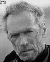
Since I'm a movie buff, I also like to imagine who would play the part of a character if the book was made into a film. I treat it like a shorthand for the character as I work on the project. If I'm stuck with a scene or a line of dialogue, I just picture the actor performing the action and it provides some momentum. For ONE's main character, I knew I wanted him to be older and weathered. And the second I realized he needed a face, I'd thought of Clint Eastwood's character in Unforgiven.
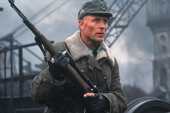
Scars, squinted eyes, wrinkles, crow's feet - the whole nine. Then I rememberd how much I liked Ed Harris' character in Enemy at the Gates. He played an older, battle-hardened German sniper who was sent to hunt down Jude Law.
 There was something very cool about Harris in this role that I wanted to replicate in the main character's head/face. He was calculated and thoughtful. Harris made you believe that he could stalk someone down and snipe them from hundreds of yards away with only one shot.
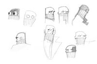
All that being said, here's my first sketchbook attempt:
 A few good things came out of these sketches that found their way to the final design - the bald head, the scarf design, and the eye scar. The bald head made sense because it suggested age and a level of sophistication or aristocracy. Think Captain Picard in Star Trek: The Next Generation. The scarf covering the face reinforced the post-apocayptic Mad Max thing I'm going for. And the scar made him look bad ass.
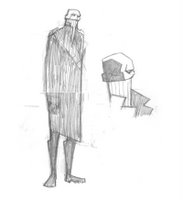
With those elements in hand I took one more trip to the sketchbook. Here's the result:
 He came out a little too lanky so I had to crop the sketch a little. But overall, I'm diggin' his look. Not only will he be fun and relatively easy to draw, the design allows me to play around with contrast and shadows.
"I love it when a plan comes together."
Bernie

No comments:
Post a Comment