The more I find out about guys like
Maurice Noble,
Tex Avery,
Bob Clampett, and
Chuck Jones, the more their accomplishments in illustration and animation blow my mind.
Sidenote: If you're not reading
Cartoon Modern by Amid Amidi, you need to get on the bandwagon. This has become one of the sacred inspirational books of my library (along with the
Art of The Incredibles,
Batman Animated, and
The Art of Hellboy). In addition to the well-researched chapters on the various animation studios of the 50s era, Amidi has compiled an extraordinary amount of artwork that will blow your mind.
Like most kids (well maybe not today’s kids) I grew up watching Warner Brothers’ Looney Tunes and Merry Melodies. But it wasn’t until recently that I was able to appreciate all of the innovative design work that their cartoons showcased, particularly the use of modern abstract backgrounds.
Here's a piece from
an interview with Maurice Noble that explains how that style evolved in his work:
I'd always had in the back of my mind that super-realism in the backgrounds behind flat animation was not the right approach. So when I got the opportunity, I started to place more emphasis on shapes. I started to leave off the airbrush and create the spaces by shapes instead of a lot of fussy shadows and so forth. I tried to create each frame to support the action, and not clutter up anything or interfere with a gag or bit of action.So in an attempt to learn something from Mr. Noble, I took a stab at creating a drawing with his comments in mind.
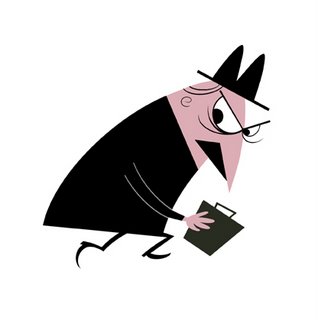
I started with this basic figure; my rendition of a Snidely Whiplash-like baddie:

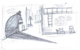
Then I sketched out a quick background:

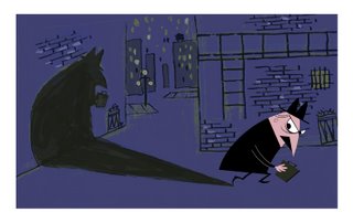
I cleaned up the character in Photoshop... ...And after fleshing out the background (also in Photoshop), I dropped in the finished Snidely Whiplash wanna-be into the picture and came up with this:

Bernie
 After cleaning the picture in Photoshop, I rearranged the musicians, referenced big band flyers and ads from that era to come up with design ideas (gotta love Google's image search!), threw in some colors, and came up with this:


