Since I've already covered the style I'm using for ONE, I'll go over technique.
If you think of style as being what you do, technique is how you do it. Technique is the actual mean/s the artist utilizes to get their ideas on paper (or monitor, or canvas, or music sheet, etc). Some artists like to use expensive drafting tools, some use mechanical pens bought at their local Walgreens, and others use Sharpie markers that are almost dry. They all work, but not all of them work for everyone. So while technique is important, as an artist, you can't be a slave to it. The most important thing is how to get your ideas out of your head and on the paper.
Here's an awesome quote by Neal Adams' in Will Eisner's Shop Talk that goes a little further into the topic:
"What I find is that there are many artists doing many things, and each successful artist has found his own tools. Very rarely does an artist accept the tools of another artist. His responsibility does not include responsibility to other artists or to the general public. His responsibility is to himself. The tools he uses are the tools he finds. The thing he has to think about is what is his goal, not what is his technique."
Amen. It's all about the goal. And as the artist, it's up to you to choose the best technique that will allow you to accomplish your goal.
With ONE, I want the book to feel like an episode of Samurai Jack...but in print. I want to utilize a lot of epic shots and give it a cinematic pacing. I want the reader (actually, audience is more appropriate 'cause there's only one word in the entire book so there's not much reading going on) to be able to get through the book in ten minutes. I'll let C. C. Beck (again, from Will Eisner's Shop Talk) say it best:
"Never include anything that doesn't belong there...[convey] a message to the reader in the simplest form...[Most] young artists are so anxious to show off, all of them, to show things that they can do, that they throw in a bunch of stuff that doesn't belong there. If you have to stop to figure out a picture for about three minutes, then you've lost the thread of the story."
Amen. Again.
I also want to be able to handle the creation of the book. It is, after all, my first real book. Not that I want to make it easy on myself, but I don't want to shoot myself in the foot by trying out new tools and working methods that I'm not already comfortable with. That's why I'm using the animated style. And that's why I'm sticking to good ole pen and paper (8.5x11, nothing fancy) for the actual pages and Photoshop for finishes (cleaning up, editing, coloring, design).
So with my goals in mind, I made a few ground rules. I have to give credit to Ted Mathot for sharing his own ground rules on his book, Rose and Isabel (which I'll be purchasing at the San Diego Comic Con in a few weeks). I basically ripped off some his rules. Yeah, I'll admit it. But they make 100% sense. They helped me decide how to approach ONE best; how to reach my goals.
1. ONE will be in greyscale - Like Mathot said, "Although B&W can be very challenging, it's nowhere near as difficult as color (for me)." I agree. I'm just getting into color theory so grayscale is something I can manage. I'll probably go with a color cover but as far as the interior pages are concerned, grayscale is law. This will also come in handy when I start researching printing options. Grayscale, by far, is cheaper to print than color. And if I end up using a printing service like Lulu or Dream Weaver Press, my checkbook will thank me for going gray.
2. No Rendering - Quoting Mathot: "The greys must be flat color or simple gradients. At the very most I allowed myself a drop shadow or rim light." I'm using shadows here and there to convey scope and specific moods but that's as far as I'm going to allow myself to go on ONE. I'm not even getting into using too many gradiants. Greyscales and flats - check.
3. No fancy brushes or textures - I'm still relatively new to Photoshop so I wouldn't even know how to use the fancy brushes and textures. And since I've already storyboarded most of the book, I already know where I can reuse and repurpose backgrounds. ONE is getting the KISS treatment: Keep It Simple Stupid.
4. Keep Moving - Mathot, again: "If a drawing isn't right (and there are many I'm not totally happy with) I have to keep going. I'll take a few whacks at it, but then move on. If it really bothers me, I'll try to come back to it later." I'm pretty anal about my work but if I plan to stick to my schedule, I can't get hung up on minutiae. And speaking of scheduling...
5. Come up with a schedule and stick to it - Quoting Mathot: "This is absolutely essential. Know how much work you need to do and how much time you have to do it. Comics are great for time management cause you can break them down by pages. You can assign X number of pages per month, week, day, etc. If you fall behind or get ahead it's easy to adjust that number." Told ya, the man knows what he's talking about.
Initially, my deadline was mid-July, just in time to have the book completed by the San Diego Comic Con. But reality has set in and the possibility of completing what has grown to be a 250+ page book (aka monster) in the next month has been thrown out of the window. So taking into account what I've done so far, what I need to do, and those pesky real world things that are bound to materialize along the way, ONE should be finished by the end of this year. I may be able to finish the book before then but that gives me ample time to do some quality control and make sure my first book is a good book, at least to me.
Now that style and technique are in the rearview, time for more pretty pictures. Next up - storyboards.
Bernie

6.15.2006
6.13.2006
Cars
My ten-year high school reunion went down this weekend, making me feel really old. Well, that didn't bother me nearly as much as feeling like I haven't developed or utilized my drawing skills to a higher level. I've seen the volume of work some of my peers have produced and it's enough to make this grown man cry. But I'm not one to sob in the corner so I put foot to ass and went to work.
So after Surly Sergio's Sombreros and between some sudden and unfortunate family issues, I found two hours to watch Disney and Pixar's Cars.
I know, I know. Not exactly work but it's kinda like reference. Kinda.
The movie was good; not Pixar's best but a good, entertaining film nonetheless. The set up for the film took a little too long but once the action moved to the small town (Radiator Springs), the movie went into (excuse the pun) high gear. But overall, the animation was solid and the voice acting was spot. Then again, it's not like they went out on a limb with the character archtypes they choose (ex. Mexican lowrider car voiced by Cheech Marin; Redneck towtruck voiced by Larry The Cable Guy).
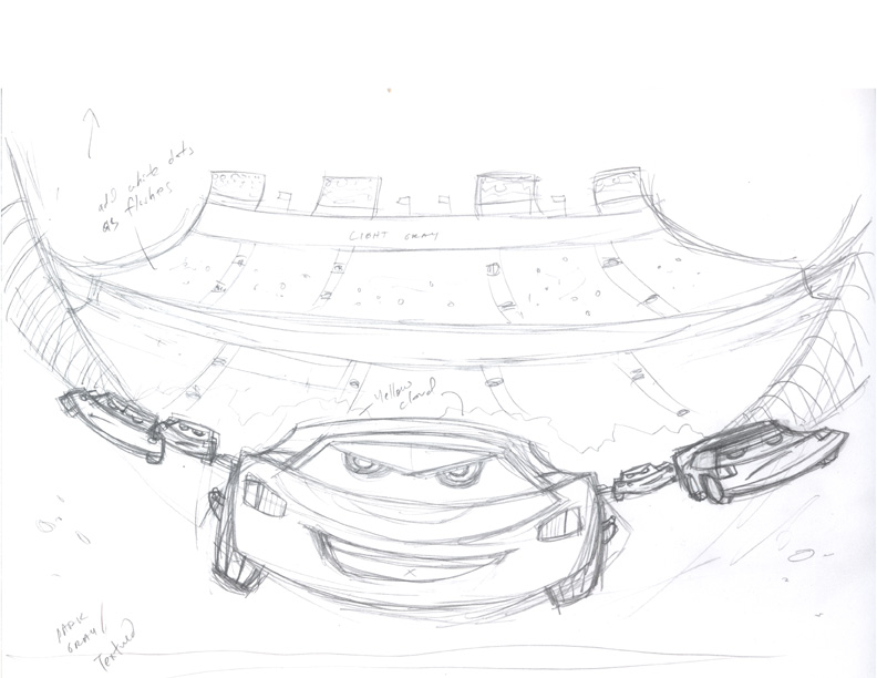
So, back to getting some more drawing under my belt. With Cars as inspiration, I did some sketching. Here's the result:
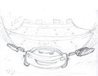
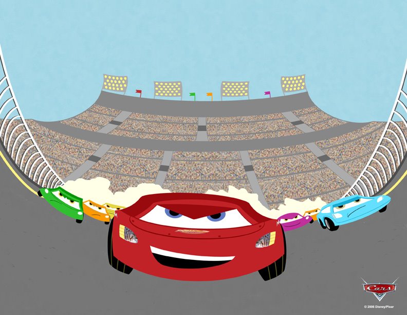
And after a few hours of Photoshop-ing, here's the final drawing:
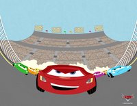
Turned out OK. I could've done more with the overall perspective and the car designs but the drawing was just a quick reaction to watching the film.
Enough digressions for this week. Now back to ONE.
Bernie
So after Surly Sergio's Sombreros and between some sudden and unfortunate family issues, I found two hours to watch Disney and Pixar's Cars.
I know, I know. Not exactly work but it's kinda like reference. Kinda.
The movie was good; not Pixar's best but a good, entertaining film nonetheless. The set up for the film took a little too long but once the action moved to the small town (Radiator Springs), the movie went into (excuse the pun) high gear. But overall, the animation was solid and the voice acting was spot. Then again, it's not like they went out on a limb with the character archtypes they choose (ex. Mexican lowrider car voiced by Cheech Marin; Redneck towtruck voiced by Larry The Cable Guy).
So, back to getting some more drawing under my belt. With Cars as inspiration, I did some sketching. Here's the result:
And after a few hours of Photoshop-ing, here's the final drawing:
Turned out OK. I could've done more with the overall perspective and the car designs but the drawing was just a quick reaction to watching the film.
Enough digressions for this week. Now back to ONE.
Bernie
6.10.2006
Weekend Digression Part 2
Still working on ONE...really. The focus for this week has been on storyboarding the story. I have an idea on how the entire book plays out but I wanted to thumb(nail) out some of the key scenes to make sure it flows. I'll post some of the thumbs next week and also discuss the logistics on how I'm going to go about actually completing the pages. I may have addressed style, but technique is also extremely important, especially on a project like ONE. In the meantime, here are a few pretty pictures.
Continuing with the retro cereal box theme - Surly Sergio's Sombreros.

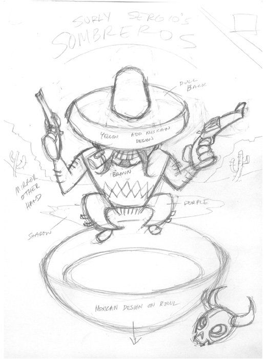
Not much in the initial sketch but I put down just enough to figure out where to go with the piece. I wanted Surly Sergio to have a Yosemite Sam-like quality; a short ball of fire that could go crazy anytime. I also added a little Eli Wallach from his character in The Good, The Bad, and The Ugly. Now on to the next step...
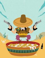
I added a few elements like the "XXX" beer bottle (probably NOT on your average supermarket cereal box), changed Sergio's left arm (mirroring the right arm just made sense), and came up with a solid look for the actual cereal. Like Perky Pete's Pigtails, Sombreros are much easier to imagine as cereal than an actual drawing. And a quick Google search gave me a few references for the Mexican styled bowl. I also added a slight texture to the sky so it would stand instead of being just a flat light blue. So far, so good.
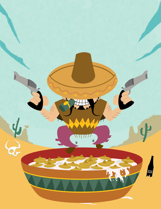
Here's the final cereal box design:
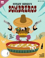
Not as retro as I wanted but, well, too bad. As I was adding the design elements, I thought of a few things I could change to give it a true retro feel but I decided that the piece was solid on its own. I'm happy with Sergio's design, I like the overall color scheme, and texturing the sky was a new learning lesson. So I'll put the ideas in my mental toolbox and utilize them on the next drawing.
I have two more ceral box designs left: Happy Hippo's Hoops and an extra special cereal that I'll share before the end of the month. Stay tuned.
Bernie
Continuing with the retro cereal box theme - Surly Sergio's Sombreros.
Not much in the initial sketch but I put down just enough to figure out where to go with the piece. I wanted Surly Sergio to have a Yosemite Sam-like quality; a short ball of fire that could go crazy anytime. I also added a little Eli Wallach from his character in The Good, The Bad, and The Ugly. Now on to the next step...
I added a few elements like the "XXX" beer bottle (probably NOT on your average supermarket cereal box), changed Sergio's left arm (mirroring the right arm just made sense), and came up with a solid look for the actual cereal. Like Perky Pete's Pigtails, Sombreros are much easier to imagine as cereal than an actual drawing. And a quick Google search gave me a few references for the Mexican styled bowl. I also added a slight texture to the sky so it would stand instead of being just a flat light blue. So far, so good.
Here's the final cereal box design:

Not as retro as I wanted but, well, too bad. As I was adding the design elements, I thought of a few things I could change to give it a true retro feel but I decided that the piece was solid on its own. I'm happy with Sergio's design, I like the overall color scheme, and texturing the sky was a new learning lesson. So I'll put the ideas in my mental toolbox and utilize them on the next drawing.
I have two more ceral box designs left: Happy Hippo's Hoops and an extra special cereal that I'll share before the end of the month. Stay tuned.
Bernie
6.05.2006
On Style
After a weekend of ballyhoo and hijinks, it's back to work on ONE.
With the main character designed and the the first background complete, it's time to answer some of the big questions regarding the project. The foundation for ONE, the high concept, is pretty simple when you think about it (here's a reminder for those that came in late):
One world. One main character. One bad guy. One journey. One spoken word. One climax. One panel per page. One book. One creator.
The high concept is great but its execution will determine if it works. That's where style and technique come in; two very different beasts that are sometimes mistakenly equated with each other.
I'm sure I'll get a few disagreements out there but in my mind, style comes from the artist. It's the extension of the person's personality/influences, translated through a medium (paper, film, music, etc) and determined by the artist's level of skill. Sure, whatever inspires you will likely work it's way into the art you produce. But as a creator, your mind acts as a funnel for everything you've been exposed to that has peaked your interest on numerous cognitive and intuitive levels. Your skill allows those ideas to take shape to the best of your abilities. And like any other muscle, you have to develop it if you want it to get stronger. The more you draw, the stronger and more personal your style will be.
Admitingly, my style has been a work in progress. Still is. Will be for as long as I draw. It's a constant evolution that is affected by everything around me. I think the growth comes from finding what you like to do and making it your own. You start with a solid foundation of what feels "right" and you run with it. You create. And you let the creations represent you because, in many ways, they are you. Sure, you may like the way another arist draws an ear or a hand so you incorporate it into you own skill set. Into your style. That's natural. Just like Jack Kirby said: "One man is a school for another.” But knowing your style is being comfortable in your own skin. Knowing just enough about yourself to be able to express it.
I'm not sure who said it but I guess when you think about it, putting pen to paper is a brave act.
As for me, my school is varied - Alex Toth, Jack Kirby, Bruce Timm, Akira Kurosawa, Rod Sterling, Gendy Tartovsky, Mike Mignola, Scott Morse, Frank Espinoza, Ben Caldwell, Darwyn Cooke, Tim, Biskup, Dan Krall, Ted Mathot, Mark Andrews, Sam Hiti, Matt Hawthorne, Dave Johnson, Lesean Thomas, Sandford Greene, Jim Mahfood, Dave Crosland, Mike Huddleston, Ghostbot, Guy Davis, Ashley Wood, Ragnar, Ovi Nedelcu, Erik Larsen.
All these creators have somehow affected my style. And for ONE, I wanted to be really comfortable in my own skin for the first time. So far, you've seen some of the sketches for the project and you can see that I'm going with an "animated" style. Look at my portfolio and you'll find Tim Bradstreet, Travis Charest, Jim Lee, and countless of other comic artists. It took years of drawing to finally find my way...but animation has always been a big influence. It's tied directly into my love of film and my love for illustration. Animation marries them like no other medium can.
But I'm coming to the realization that the "animated" style is my style. It feels "right." It's my perspective. And like my dad always said, "It's all about perspective."
Bernie
6.04.2006
Weekend Digression
Sorry for the delay between posts but this weekend, 3/5's of the Element X crew (Amado, Marcus, and myself) got together to check out some art from our respective projects and enjoy a trip to a few local comic shops. Anytime we get together, the pretty pictures are free flowin' and hours start disappearing. But the comradre of fellow artists cannot be equaled; it helps to recharge the creative batteries and it pushes you to draw more/better. So once we go our separate ways, the desire to draw left behind is hard to resist.
Anytime you work on a project, it can get easy to lose your focus and begin wavering. Not that ONE is losing it's fun factor but changing gears and drawing something completely different helps on a lot of levels. It keeps you fresh as an artist, forcing you to utilize your skills beyond the task at hand. It changes your artistic perspective. You learn to work out problems by exposing yourself to illustrating new things. And hopefully, you can add that newfound knowledge to your skill set.
You hear it all the time from the pros out there that are working on a monthly title. They start their day with a quick sketch, allowing their mind and body to loosen up before going into full sequential mode.
So...having purchased the Krazy Kids' Food! Vintage Food Graphics book recently, I wanted to take a stab at designing a fake retro cereal box. While my girlfriend was watching a 3-hour made-for-television Audrey Hepburn movie starring Jennifer Love Hewitt, I started skeching and came up with this:
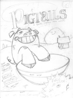
Perky Pete's Pigtails. Heh. I also came up with Happy Hippo's Hoops and Surly Sergio's Sombreros. I'll get to them soon enough. As for Perky Pete, here's the colored version, sans cereal box design:
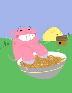
After scanning the pencils, I just dug in and finished it in Photoshop. The actual cereal was probably the hardest part. Coming up with the name was easy. But drawing actual cereal pigtails? Not so much. I also did a few designs for the bowl but quickly realized that a detailed design, however retro, would go against the simplicity of the overall drawing.
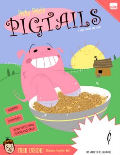
After a few hours of work, here's the full-blown retro cereal box:
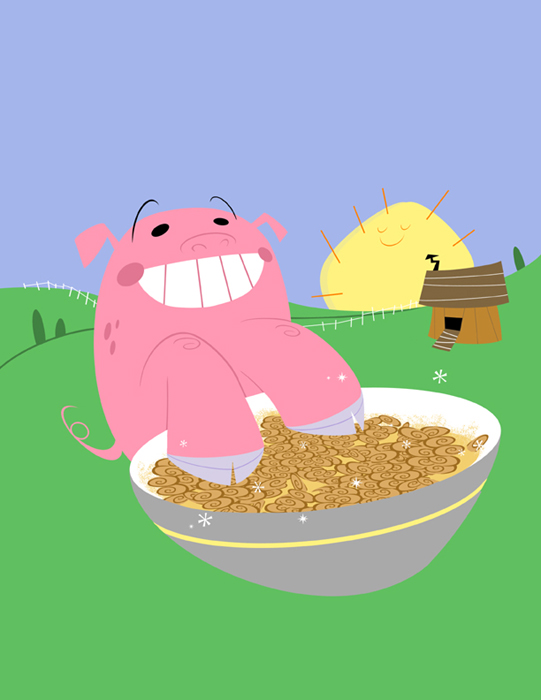
And because I couldn't resist...
 The whole thing took the better part of my Sunday. What can I say, I'm a little anal about design and I wanted to make sure it was perfect (plus, as hard as it may be to believe, I didn't mind missing out on the Audrey Hepburn flick, even if it was Jennifer Love Hewitt's best acting performance to date...next to Scream, because, well, she screamed...alot). But the whole process was worthwhile. I'm pretty happy with the drawing and I learned a few Photoshop shortcuts that I'll take with me when I go back to ONE. Problem is, now I can't wait to work on Happy Hippo's Hoops and Surly Sergio's Sombreros.
If there were only more hours in the day there'd be time enough at last (a little Twilight Zone reference for those not in the know).
Bernie
Anytime you work on a project, it can get easy to lose your focus and begin wavering. Not that ONE is losing it's fun factor but changing gears and drawing something completely different helps on a lot of levels. It keeps you fresh as an artist, forcing you to utilize your skills beyond the task at hand. It changes your artistic perspective. You learn to work out problems by exposing yourself to illustrating new things. And hopefully, you can add that newfound knowledge to your skill set.
You hear it all the time from the pros out there that are working on a monthly title. They start their day with a quick sketch, allowing their mind and body to loosen up before going into full sequential mode.
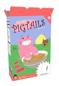
So...having purchased the Krazy Kids' Food! Vintage Food Graphics book recently, I wanted to take a stab at designing a fake retro cereal box. While my girlfriend was watching a 3-hour made-for-television Audrey Hepburn movie starring Jennifer Love Hewitt, I started skeching and came up with this:

Perky Pete's Pigtails. Heh. I also came up with Happy Hippo's Hoops and Surly Sergio's Sombreros. I'll get to them soon enough. As for Perky Pete, here's the colored version, sans cereal box design:
After scanning the pencils, I just dug in and finished it in Photoshop. The actual cereal was probably the hardest part. Coming up with the name was easy. But drawing actual cereal pigtails? Not so much. I also did a few designs for the bowl but quickly realized that a detailed design, however retro, would go against the simplicity of the overall drawing.
After a few hours of work, here's the full-blown retro cereal box:

And because I couldn't resist...
 The whole thing took the better part of my Sunday. What can I say, I'm a little anal about design and I wanted to make sure it was perfect (plus, as hard as it may be to believe, I didn't mind missing out on the Audrey Hepburn flick, even if it was Jennifer Love Hewitt's best acting performance to date...next to Scream, because, well, she screamed...alot). But the whole process was worthwhile. I'm pretty happy with the drawing and I learned a few Photoshop shortcuts that I'll take with me when I go back to ONE. Problem is, now I can't wait to work on Happy Hippo's Hoops and Surly Sergio's Sombreros.
If there were only more hours in the day there'd be time enough at last (a little Twilight Zone reference for those not in the know).
Bernie
Subscribe to:
Posts (Atom)